With smart phones now making up more than 50% of online traffic it's critical that you provide your users with a website that is optimised for mobile devices including iPhone, Android and Windows Phone.
Add this to the fact that in April 2015 Google released an update to their search algorithm (dubbed "Mobilegeddon") which favours websites that are mobile friendly, and you're not left with any choice but to go mobile or risk being left behind by the competition.
What's involved in making a website mobile friendly / responsive?
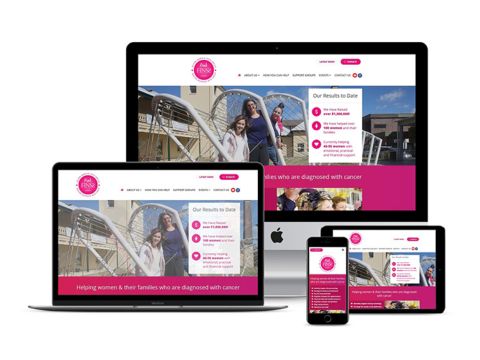
There are two main methods for making a website responsive whether your developing a new website or updating an existing one, the most popular is called Responsive Web Design and involves having different sets of style rules for your website that activate or deactivate based on the current width of the browser window, the mobile styles kick in when the browser is small and the desktop styles take over when the browser is large. The Point Blank Development website uses responsive web design so if you're reading this on a desktop you can see how it looks on mobile by simply reducing the width of your browser.
The second approach is called User Agent Detection or User Agent Sniffing and is done by detecting the type of device you're using and displaying an optimised version of the website for your device. This approach gives more control over what can be changed and is generally used if the functionality, content or structure of your mobile site is sufficiently different from the desktop that not only the styles but also the structural code must be changed between the mobile and desktop versions.
Responsive Web Design vs User Agent Detection
These two methods aren't mutually exclusive, a combination of Responsive Web Design & User Agent Detection can be used on different pages within a website or even different sections within a page, you can think of them as different tools for the same job and choose whichever is best for each situation.
For example imagine you have a mobile friendly website that's been developed using responsive web design and there's a new request for a promotional page that needs to display a different promotion for iPhone, Android and Windows Phone devices. In this scenario user agent detection will need to be used to detect which phone is being used to display different content for each device (iPhone, Android and Windows Phone), this will be used in combination with the existing responsive web design that's already in place for making the site mobile friendly.
Responsive Web Design at Point Blank Web Development Sydney
At Point Blank Development we specialise in responsive web design and mobile friendly web development, since the explosion of the mobile web we've developed a heap of responsive websites and added mobile friendly versions to many existing sites for clients in Sydney and Australia, we know what works and what doesn't across mobile, tablet and desktop devices.
We have extensive experience in both methods of making websites responsive (responsive web design & user agent detection) and will recommend the best approach based on your specific business requirements.
Whether you're updating an existing site or creating a new one, we can help you realise your website goals and get the best results for your business.
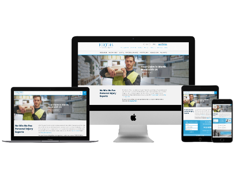
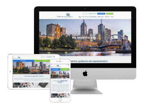
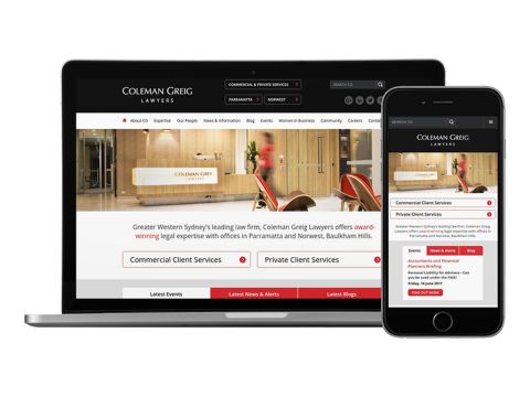
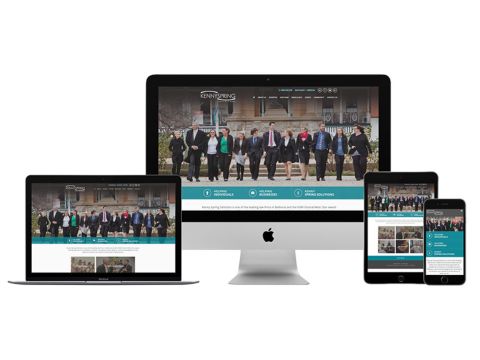
Check out some of our responsive mobile friendly websites.